People are looking for your product or service. Can they find you?
In 2025, search engines are the front door to the internet. When people need a product or service, they Google it. In fact, the vast majority of web visits begin with a search engine. If your website doesn't come up on the first page of search results, you're missing out on the customers who are actively seeking your products or services. Literally, you're invisible.
The challenge with SEO is that many practitioners focus heavily on technical details that often don't move the needle in terms of rankings. These techniques are widely prescribed in books, YouTube videos, and online courses, but they simply fail to produce results. The key to consistent, effective SEO is understanding which ranking factors have real impact and knowing how to apply them to deliver rapid, sustainable improvements.
SEO brings you qualified traffic. These aren't random visitors. They're potential customers who typed in keywords related to your business because they have a want or need right now. They have intent, and when you rank well, you're catching them at the exact moment they're poised to make a decision. That's why SEO consistently delivers one of the highest ROIs in marketing. And unlike paid ads that disappear the minute you stop paying, SEO continues to build momentum over time. A well-optimized site can generate leads for years without the constant babysitting and tweaking that ad campaigns require.
Then there's credibility. People trust Google, and studies are clear: they prefer organic search results to paid ads. When your business shows up at the top, you look like an industry leader. If someone searches for what you do and can't find you, it raises questions. Are you legitimate? Are you still in business? Search rankings create initial impressions before anyone even clicks through to your website.
In 2025, SEO is fundamental marketing. If you're not doing it, rest assured that your competitors are, and they're capturing market share that could be yours. Ignoring SEO means letting opportunities slip through the cracks. The real question isn't whether you can afford to invest in it; it's whether you can afford not to.
The problem is, achieving high search engine ranking is fraught with challenges. SEO offerings today are as numerous and ineffective as miracle weight loss plans or get-rich-quick schemes. "Experts" promise quick and guaranteed results, but rely on outdated tactics that do more harm than good. Search engine algorithms evolve constantly, making yesterday's strategies obsolete or even dangerous. So how do you figure out the right approach? How do you choose the right SEO expert?
Lost Highway Media has built, and continues to build, a track record of proven success in the art and science of SEO. We apply safe, effective white-hat strategies that get our clients' websites to the top of search engine result pages (SERPs)—quickly. And we do it at a fraction of the cost of our competitors.

"Brian delivers his services with exceptional professionalism, reliability, and creativity. He consistently offers quality solutions demonstrating strong problem-solving skills and has become a trusted business partner that brings expertise and value to every project."
Joe Bockerstette
Business Enterprise MappingScottsdale, AZ

"We could not be more pleased with our website and the SEO work Lost Highway Media does on a monthly basis. We receive excellent ROI and are still seeing massive increase in traffic on our site."
Casey Dennis
Legion StaffingDallas, TX
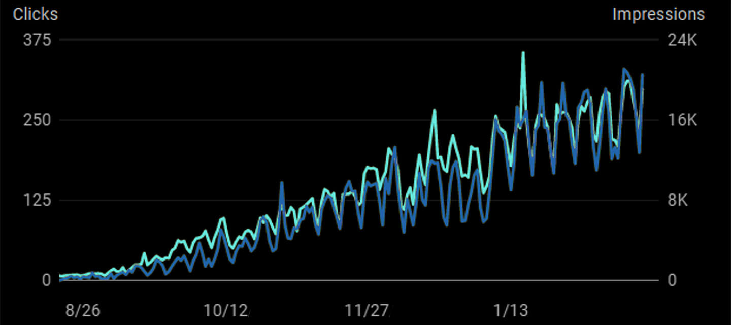
Page-One Organic Results = Optimum ROI

SEO: THE CHALLENGES In 2025, navigating the risks is harder than ever.
SEO offerings today are as numerous and ineffective as miracle weight loss plans and get-rich-quick schemes. "Experts" promise quick rankings and guaranteed results but rely on outdated tactics that usually do more harm than good. Search engine algorithms evolve constantly, making yesterday's strategies obsolete or even dangerous.
SEO: THE SOLUTION A track record of proven success in the art and science of SEO.
Studies are clear: web users prefer organic search results over paid ad results. At Lost Highway Media, we apply safe and effective white-hat strategies that get our clients' websites to the top of search engine result pages (SERPs)—quickly. Someone out there today is looking for the product or service you provide. Can they find you?

"Thanks to Brian Burns for all of the work he did on this website. I highly recommend Brian for all of your website development needs, as he makes a great product and will work diligently for you and your team."
Ryan Kravik
Thorn NetworkDallas, TX

"Brian took the time to understand our business and redesign our website to best reflect who we are. He is also very responsive to ongoing requests and updates. We do recommend Brian and Lost Highway Media!"
Christine Feddern
Solid IT NetworksHouston, TX